

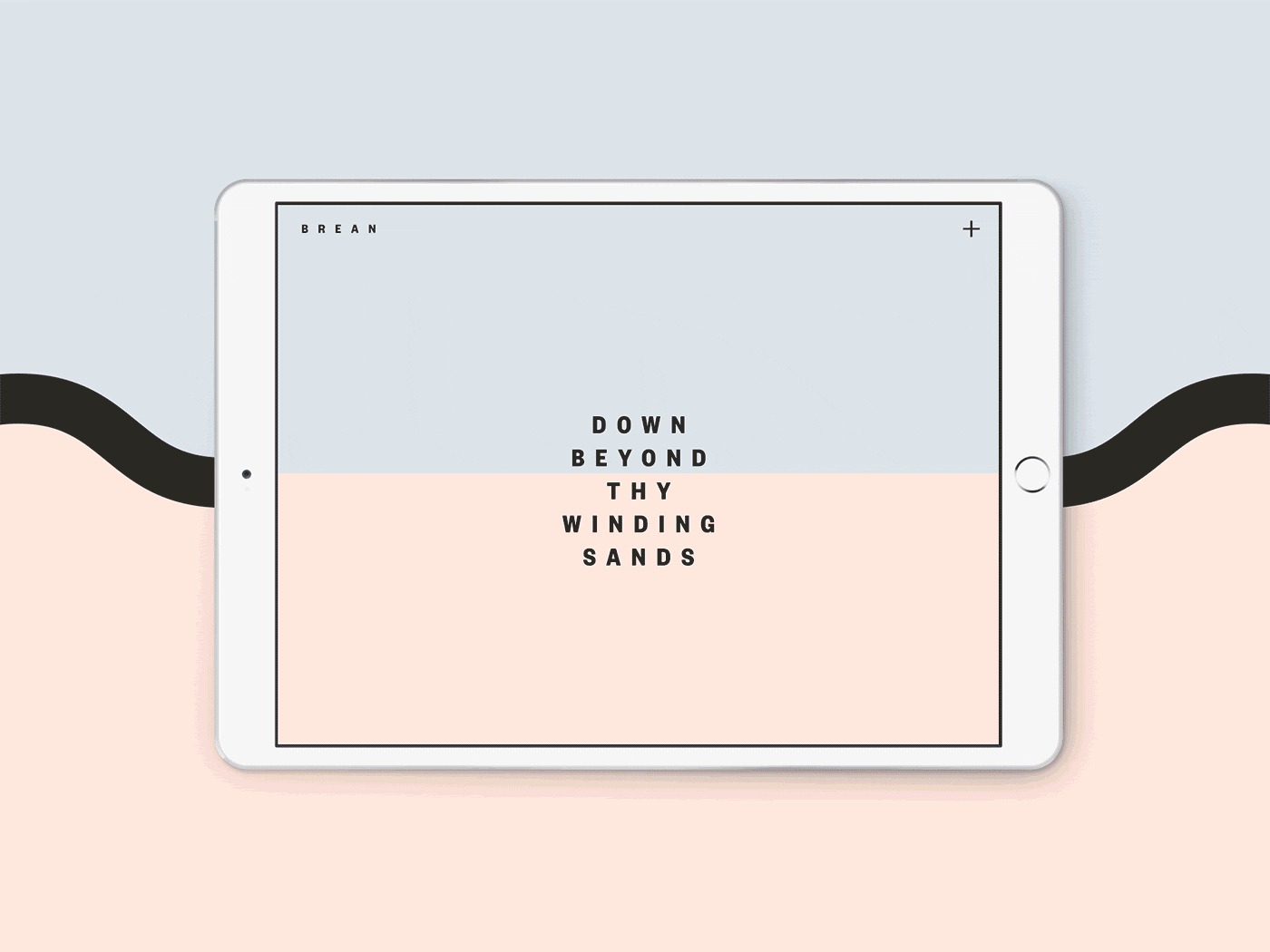
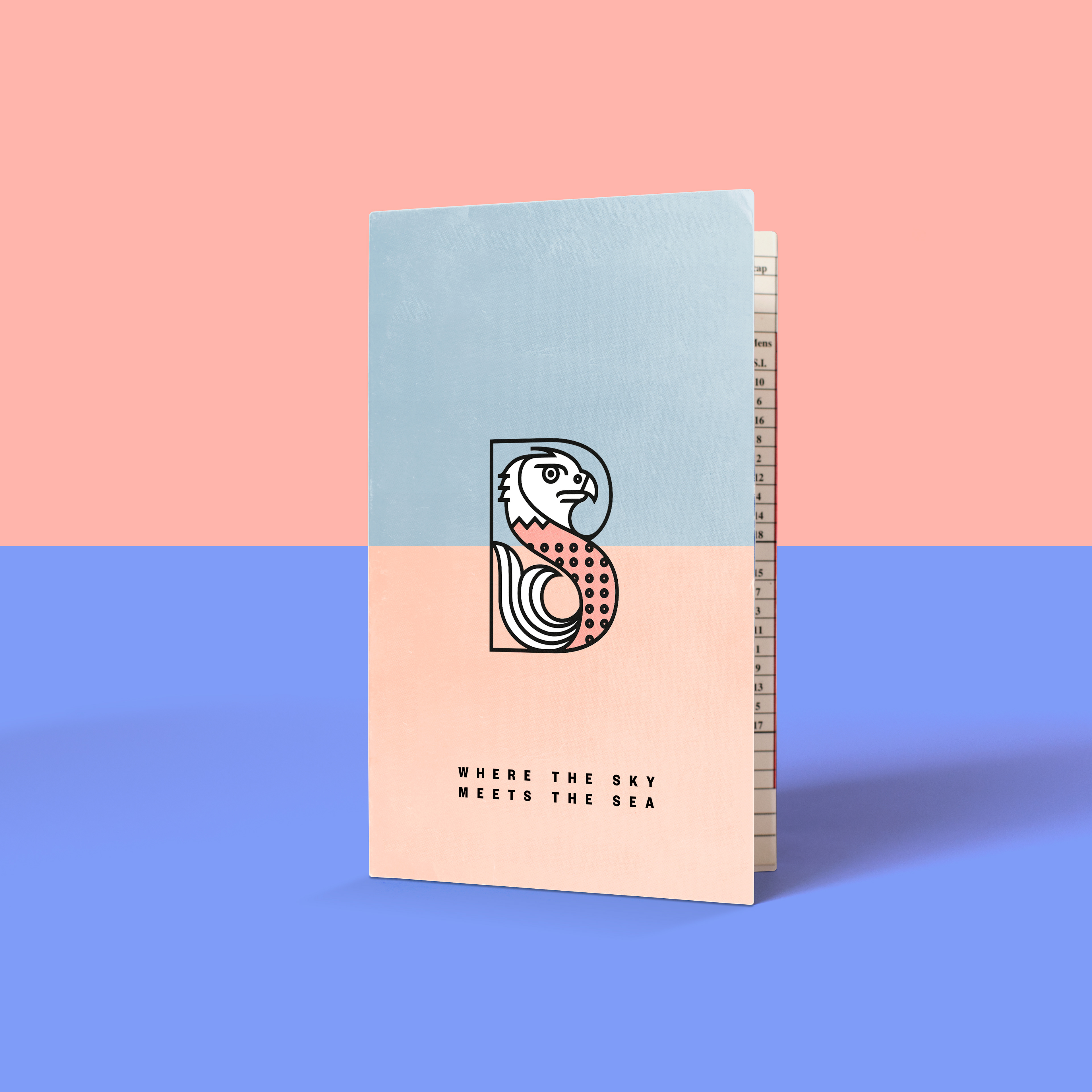
WHERE THE SKY MEETS THE SEA.
A NEW TYPE OF COUNTRY CLUB
After a decade of decline in the membership of golf and country clubs it’s clear that to thrive you must offer something different, that fits in with the way people now want to spend their leisure time.
With the investment in a new clubhouse, Brean had an opportunity to bring together their golf, leisure, and property brands all under one umbrella, offering a new kind of affordable and fully-flexible modern membership.
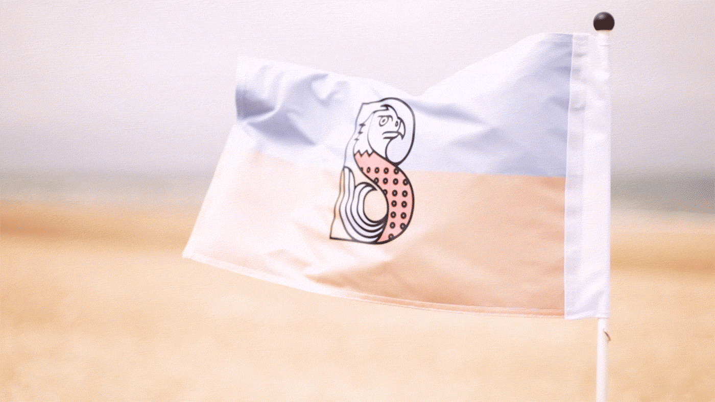
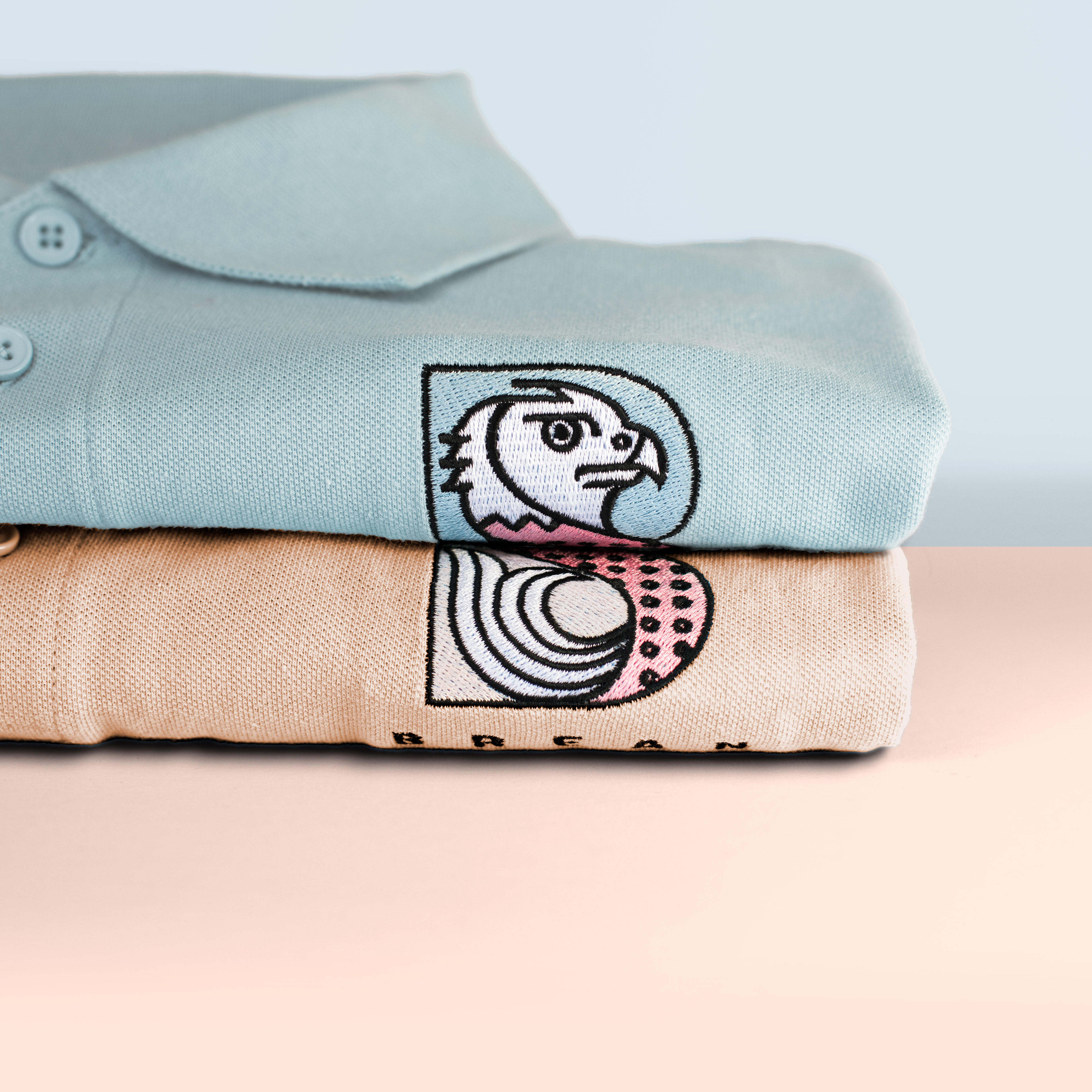
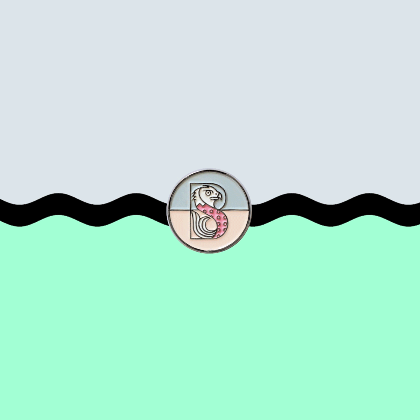
Inspired by the unchanged landscape of the Somerset levels, which are defined by vast horizons, the new emblem brings together a Merlin (often seen flying in the skies around the grounds) and a Bream, which populates the rivers and streams that criss-cross the site.
CRAFTING THE EMBLEM
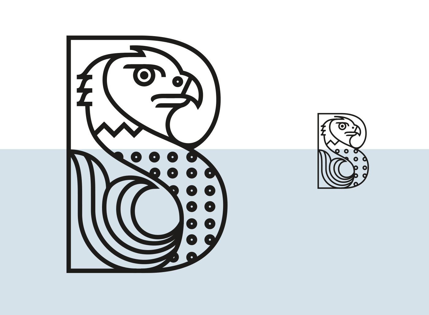
The main part of this project was crafting the emblem. We tried many iterations in our initial sketches to combine the 'B' of Brean with a Merlin bird of prey to represent the sky and a fish to represent the water. Discovering that the two animals do not easily fit together, and whilst also trying to maintain a strong horizon within the marque, all led to a complex visual problem that was a lot of fun to solve.

We created a smaller version of the emblem for use on small sized applications.
Modifications included increasing the size of the eye of the eagle, as well as reducing the number
of scales (circles) on the fish's body .
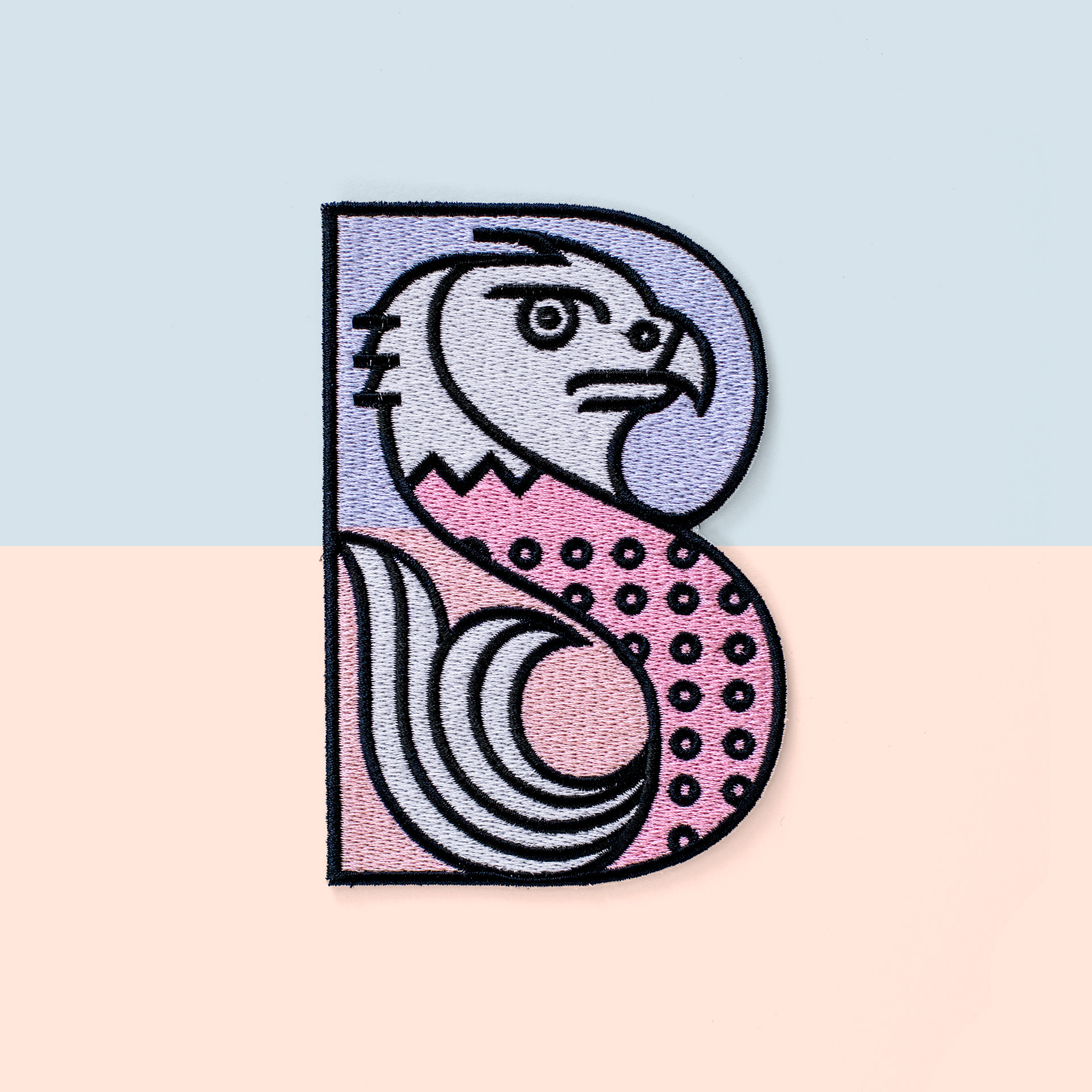
Printed patch


Art Direction & Design
Illustration
Thank you.